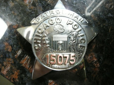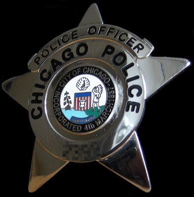

Chicago, IL—Okay, I’ll spread a rumor! The Chicago Police Department will be changing their stars once again. Credit for starting that rumor goes to Second City Cop.
From time to time police agencies change their star of badge design. The stars get old and worn needing to be replaced. Then there is the matter of stars winding up in the hands of civilians that would use them to gain trust of their victims in order to facilitate serious crimes.
Most lost police stars are never really lost. As a policeman’s career enters the twilight stage, there is an extraordinary thing that happens. These old coppers lose their stars and usually take a three day suspension for their negligence. The reality is it’s difficult to give up the symbol of who you are.
Cops also want their children and grand children to always have possession of that symbol long after the old cop’s gone, to that great police beat in the sky. Do they really need cops in Heaven I ask? Somehow I don’t think so.
Chicago police had a great design from 1955 through 2002. That star was a downright pretty piece of artwork. At least three companies made that star, Metal Arts of New York, C.H. Hansen of Chicago and Blakington. The star was difficult to counterfeit and was extremely durable.
In 2002 Blackington was commissioned to make a new star. There offering was and is cheap looking and can’t take more than a year’s worth of use without having to be repaired or remanufactured. As cheap as that star looks, Blackington has made a fortune on them unless of course the repairs were covered by a warrantee.
I think I have the right idea for the next star design. Let’s have a rebirth of the 1955-through 2002 model! This time it should be made one third larger. That will satisfy the need to make a different design altogether. That city seal sculpture is the greatest found anywhere. The only other change is for that star to read the gender neutral term police officer rather than Patrolman, Policewoman and Matron.
The city could also save a bundle if rank was not shown on the star. They can put rank insignias on the official ID card and on the officer’s name tag or uniform. The Gold Star endowed officers want their gold so I’d let them fight out that problem.
My working Chicago police pals should get involved in this design effort. They are the ones that will be wearing whatever gets issued.

Comments
First of all, the design was changed because almost 5000 numbers were out of service. A lost shield or star meant that number could not be used again. By totally redesigning the star/shield, all these numbers could be brought back on line. Another major factor was the investigator star the Department of Revenue used. It was almost a mirrored copy of the police star, and instead of saying "Chicago Police" it said "City of Chicago". I had stopped a guy once who flashed his badge, but when I asked for an ID card, he didn't show a PD ID, he showed a City ID. That's when I said "WTF" to myself and inquired, finding out the city allowed DOR to copy our design. The new design is copywrited and may not be utilized by any other city department.
The actual design of the star went through many changes. The color bands were based upon traditional colors used for rank. Black for P.O. and Detective because of the black banner used on the Detective star when the 20000 series was made. Blue for Sergeants because that is the color of the tassel on their ceremonial batons; red for Lieutenants and Captains as their tassels are red on the ceremonial baton.
Another matter was the fact the new design could be easily read from a distance. The '55' design could not, but from 20 feet away a person can clearly see "Chicago Police" and "Police Officer, Detective, Sergeant, etc" without straining. The mind set here was easy recognition.
Finally, the original plan called for 'balls' on the points for all supervisors. As you may already know, Lieutenants and Captains have tiny balls (No joke intended) on the points of their stars and this was to be extended to Sergeants also, but the Lieutenants and Captains beefed so it was dropped.
Another point that sucks is the original intent was to do away with star numbers on shields. Detectives, Sergeants, Lieutenants and Captains do not have such shields and if they lose one, no biggie. But the powers in charge could not let such a thing happen to the lowly Police Officer, so the number on the shield remains.
The new stars have serial numbers which mean a lost star doesn't necessarily have to go out of service, or one that is damaged beyond repair can be replaced with an identical number, it will just have a new serial number.
Finally, there is no plan to redesign the star, it will just be of higher quality and hopefully enamel inserts, numbers and the like won't pop out. They should hold up better.
A big problem though with why some, and I say some, stars get beaten up is the way they are cared for, or more likely, not cared for. Leaving the star on a belt clip inside your pocket and bouncing around with the change, knife, keys etc, beats the hell out of the stars. But if your star gets too beaten up, you can pay the $22 and get a new one.
Hope that helps. For the record, I like your idea best, but they won't change it.
Letting civilian investigators from the old OPS and city hall use the same star design was a horrible idea.
That new design cannot be manufactured to stand up to the normal wear and tear. They are going to have to change that somewhat ugly design sometime anyway.
If I was the department dictator uniformed female officers not working patrol would be in the old policewoman uniform.
I’d order all officers dark blue shirts and ditch the baseball caps and cargo pants to the landfill. The regulation trademark field cap would be worn by all patrol officers. The old practice of three day suspensions for not wearing the caps outdoors would end out side of traffic stops.
Of course that hideously ugly winter cap with the ear flaps is needed for Chicago’s brutal winters.
Today the officers in most district roll calls look like a train wreck.
What ever happened to the signs on department mirrors asking, “Does your appearance command respect?”
I remember the old days when of the homicide dicks used to wear the most expensive suits they could. The fabulous fedoras and pinky rigs were the rage.
The dicks would wiggle their pinky with the ring to the uniformed boys to let them know they were the police instead of wearing or showing their stars.
First of all I, nor any other Lieutenant or Captain I know was consulted regarding the new star design. So, we didn't beef about the idea of putting balls on the Sergeants stars. Although, I would have objected, in line with your "easy recognition" argument. Although, that is a ridiculous argument considering the old design was actually unique to Chicago and recognized the world over. Unlike the new design which is in use with minor variations by dozens of departments. Blackington's makes so many versions of the new star we might as well be wearing mall security star.
The serial number feature is complete BS as well. No one who has lost a star since the introduction of this new design has been able get a replacement star with the same number. So tell me, who the hell can I call to get this POS star replaced. I'll gladly pay the $22 you claim.
We could have just reissued the 195 design with the serial number feature on the back and served the exact same purpose.
Bottom line is the new stars look like crap, don't hold up worth a damn, regardless of how you "care" for them and still result in you having to get a new number, not just when you lose one but even if it gets broken or damaged.
It was purely a vanity move by some non-com ouse mouse hiding in an office at HQ who wanted to leave his mark. My money is on Brad. In fact "It's not all real" sounds quite a bit like Brad. If it is please give it up already. Nobody is buying your crap.
Funny that no one has ever had the balls to admit to being responsible for this abortion.
Most likely someone also got a little financial benefit after getting the department to piss away a load of money on this fiasco
By the way, the old design is copyrighted. Just try getting a copy made of one.